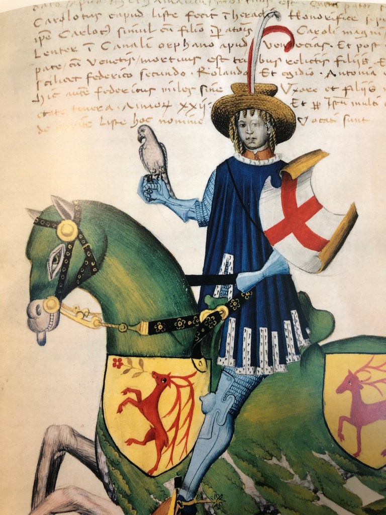
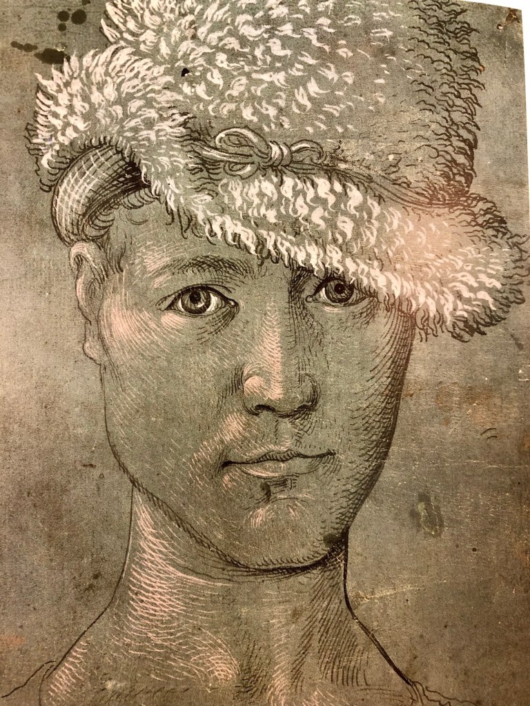
This is the fourth book in the series of books by Michel Pastoureau that detail how colors have been perceived and used through European history that I’ve read. It’s convenient that I was reading this along with the Greenlights book, which has all the green print and green pages. I find the color series really interesting and entertaining, so if you like colors, check out Green: The History of a Color. A lot of what I learned surprised me.

You do begin to feel sorry for green, like you did poor yellow in the book I read most recently. It really didn’t get much mention in historical texts, and wasn’t even used in paintings for a long time. One reason was that it has always been difficult to get a green dye that wasn’t made of copper or arsenic or some other poisonous substance. The safe ones were pretty dull. Another was that people just didn’t divide things into colors the way we do now, so a lot of what we would call green was blue or brown to the eyes of people in the past.
Then, poor ole green had a bad reputation of being a color of evil, deceit, and treachery (green knights were never up to any good), unless they were very young men, who were “green” in the untested sense. As time went on, it came to symbolize young love (not necessarily faithful love), peace, and fairy folk.

People just didn’t like to wear it, other than a few brief fads where various rulers decided green was their color. Then the sickness came…apparently from covering walls with paint and wallpaper that was green. Some even think that’s what actually got Napoleon.
Green and nature do go hand in hand, though, so there is a lot of green in landscapes and such. A lot of it wasn’t very stable, though, so some landscapes that look brown were once green. And natural objects like the sky, sea, lakes, and rivers were often painted green, not blue. I found that interesting.

Since this book dealt primarily with European history, Pastoureau didn’t bring up the color green in other parts of the world. From my studies, I know that Japanese didn’t have a word for green for a long time; aoi meant both blue and green. And the number of colors languages distinguish vary from three to dozens. It just depends on what’s important in a society. For Europeans, Pastoureau notes that texture and other tactile features were more important than color in describing objects (also, apparently in the Middle East when people were writing Biblical passages), which I found pretty interesting.
In addition to all the history stuff, the illustrations in the Green book are just as gorgeous as in the others in the series. These are majorly great coffee-table books (in fact, mine are on the coffee table!) and they are just fun to page through.
Your friends will be green with envy if you display this one, with that fine smoking Jane Fonda on the cover!
Discover more from The Hermits' Rest
Subscribe to get the latest posts sent to your email.
